

Overview
Kaizen Women’s Club is a website concept designed to create a welcoming digital presence for a community focused on connecting, celebrating, and empowering women.
The website brings together information about the club, its members, lectures, awards, events, and community activities within a structured and visually engaging experience.
The design combines editorial-style layouts, vibrant imagery, soft gradients, and expressive visual elements to create a distinctive identity while keeping the content easy to navigate.
The Challenge
The website needed to communicate the personality of the women's club while presenting a large amount of community-focused content in a clear and approachable way.
The challenge was to create a design that could:
Introduce the club and its purpose
Highlight notable members and speakers
Showcase awards and achievements
Present events and community activities
Encourage visitors to become members
Make important information easy to discover
Maintain a consistent visual identity across multiple pages
My Approach
I approached the website by combining content hierarchy with an editorial visual style.
Instead of treating the website as a simple information page, I structured the experience around the things visitors would want to discover about the club — its people, activities, achievements, lectures, and community.
Large typography, photography, rounded content blocks, and flowing graphic elements were used to create a more expressive visual language while maintaining a clear navigation structure.
Visual Direction
The visual direction was designed to feel elegant, energetic, and community-driven.
The interface uses:
Editorial typography
Purple and lavender accents
Soft neutral backgrounds
Large photography
Rounded UI elements
Gradient highlights
Flowing decorative graphics
Structured content sections
These elements help create a distinctive visual identity while giving photography and community stories enough space to stand out.
Homepage
The homepage introduces Kaizen Women’s Club with a strong hero section followed by content that gradually introduces the community.
The page includes:
Club introduction
Featured content
Members and speakers
Lectures
Community activities
Events
Testimonials
Membership CTA
Footer navigation
The goal was to give visitors a quick understanding of what the club represents while encouraging them to explore further.
Community & Members
A dedicated section highlights people associated with the club and gives visitors a more personal understanding of the community.
Photography is used prominently here to make the experience feel more human rather than relying entirely on text.
Lectures & Activities
The website also showcases lectures and community activities through structured content sections.
The layouts combine imagery and supporting information to make longer-form content easier to scan.
This creates a balance between visual storytelling and informational content.
Awards Page
The Awards page was designed to give the club's achievements a dedicated space.
It highlights:
Annual awards
Winners
Supporting information
Event photography
Sponsors
Gallery content
The page uses a more editorial composition to make the award content feel significant without losing consistency with the main website.
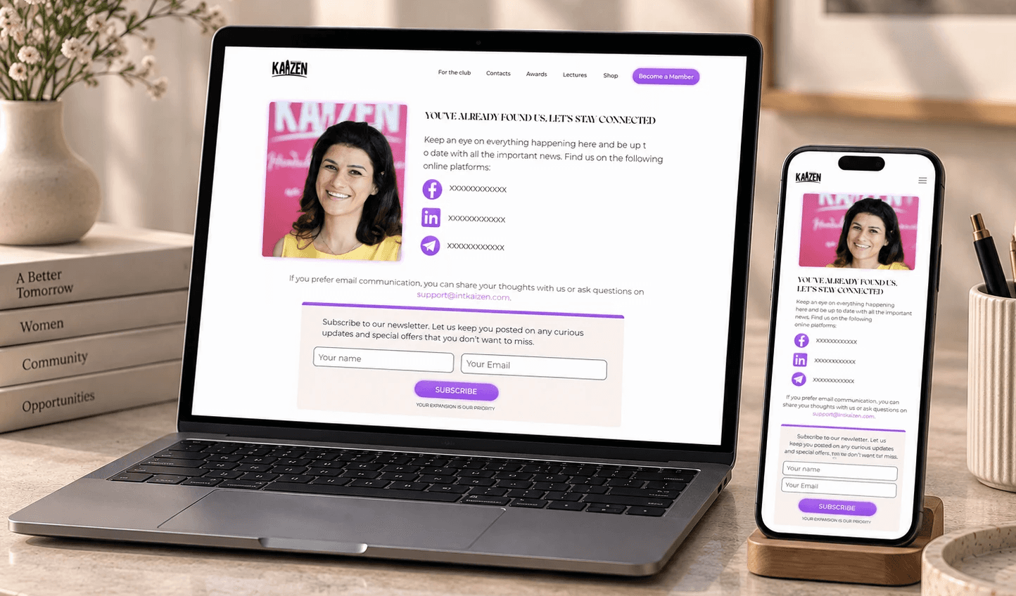
Contact Page
The Contact page focuses on helping visitors connect with the club.
It includes social channels, email communication, and a newsletter subscription area, creating multiple ways for visitors to stay connected.
Responsive Design
The website was designed to maintain its visual hierarchy across different screen sizes.
The responsive experience prioritizes:
Clear navigation
Readable typography
Flexible image layouts
Consistent spacing
Accessible content hierarchy
Touch-friendly interactions
The original project also demonstrates the design across desktop and mobile contexts.
Outcome
The final design creates a cohesive digital presence for Kaizen Women’s Club, combining community storytelling with a modern editorial interface.
The website provides dedicated spaces for the club, members, lectures, awards, events, contact information, and community content while maintaining a consistent visual language throughout.
Key Takeaways
This project helped me explore how visual storytelling, content hierarchy, and UI design can work together when designing a community-focused website.
The biggest design consideration was finding the right balance between a visually expressive interface and the large amount of information required by a community platform.


